The Frequency Lesson: 36 Strategies, One Scatter Plot, and the Trade-Count Border
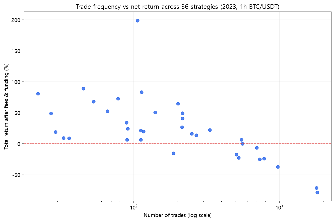
In the 36-strategy lab, every rule that traded at most 140 times a year finished net positive. Nine of the ten that traded 500+ times lost money. Trade frequency, not indicator choice, predicts survival.
The Frequency Lesson: 36 Strategies, One Scatter Plot, and the Trade-Count Border
Halfway through this lab I started tracking a second number next to every return — the trade count. By post 41 the pattern was too strong to ignore, and by now it's the most reliable result in the entire series. It's not about any single indicator. It's about how often a strategy insists on trading. Strategy Lab #43.
The scatter plot
Every dot is one of the 36 strategies: x-axis is number of trades in 2023 (log scale), y-axis is net return after fees and funding. The red line is zero.
The border
Every one of the 18 strategies that traded at most 140 times finished the year net positive. Every single one — EMA (+89.38%), EMA envelope (+80.99%), TEMA (+83.49%), linear regression (+199.09%), SuperTrend (+49.19%), WMA (+52.75%), all of them.
Of the 18 strategies that traded more than 140 times, only 8 finished positive. And the frequency edge is sharpest at the top: of the ten strategies that traded 500+ times, nine lost money. The one exception — Vortex at +6.59% — is so close to zero it might as well be a rounding error.
| Frequency band | Strategies | Net positive |
|---|---|---|
| ≤ 140 trades | 18 | 18 / 18 |
| 141 ~ 300 trades | 7 | 6 / 7 |
| 301 ~ 600 trades | 5 | 2 / 5 |
| > 600 trades | 6 | 0 / 6 |
Why the border exists
With a 0.05% taker fee, funding while long, and — in the real world — slippage you can't see, every round trip costs the account a measurable fraction. A strategy trading 140 times a year pays roughly 14 points of return in fees alone (0.05% × 2 legs × 140). A strategy trading 800 times pays 80 points. The 2023 gross edges in this lab were mostly real — the naive column is shockingly green. But those edges were 20–100 points, and the strategies that traded constantly spent that exact size on the way in and out.
The scatter plot is the whole story: the cloud of green dots sits on the left, the red dots on the right. The strategies that chose to trade less often didn't just survive costs better — they also picked the year's actual trend better, because each entry was higher-conviction. Frequency and selectivity are the same knob, and it's the only knob that mattered in this lab.
The honest caveats
- This is 36 strategies × one year × one market regime. It's a strong pattern, not a law of nature.
- Low frequency is necessary but not sufficient: five slow strategies (Bollinger on AAPL's -34% DD aside) still finished below the median, and the 141~300 band was a coin flip.
- Trade count is a decision variable, not a test result. A high-churn strategy with a genuinely larger edge (high win rate, bigger payoff) could beat the border — this lab simply never found one among the classic indicators.
Code
import pandas as pd
from backtest_base import backtest_signal, metrics
from strategy import STRATEGIES

df = pd.read_pickle("assets/data/binance_BTCUSDT_1h_2023-01-01_2023-12-31.pkl")
rows = []
for name, spec in STRATEGIES.items():
    signal = spec["func"](df, **spec["params"])
    res = backtest_signal(df, signal, 0.0005, 1.25e-05)
    m = metrics(res, 8760)
    rows.append((name, m["trades"], m["total_return"]))

rows.sort(key=lambda r: r[1])
for name, trades, ret in rows:
    print(f"{name:<16} {trades:>5} trades  {ret:+9.2%}")
Reproduce it
cd blog-drafts/scripts
python gen_special_assets.py   # regenerates this chart + all group tables
Data: Binance public API, hourly OHLCV, 8,735 bars.
This is a backtest on historical data, not investment advice. Past performance does not predict future results.